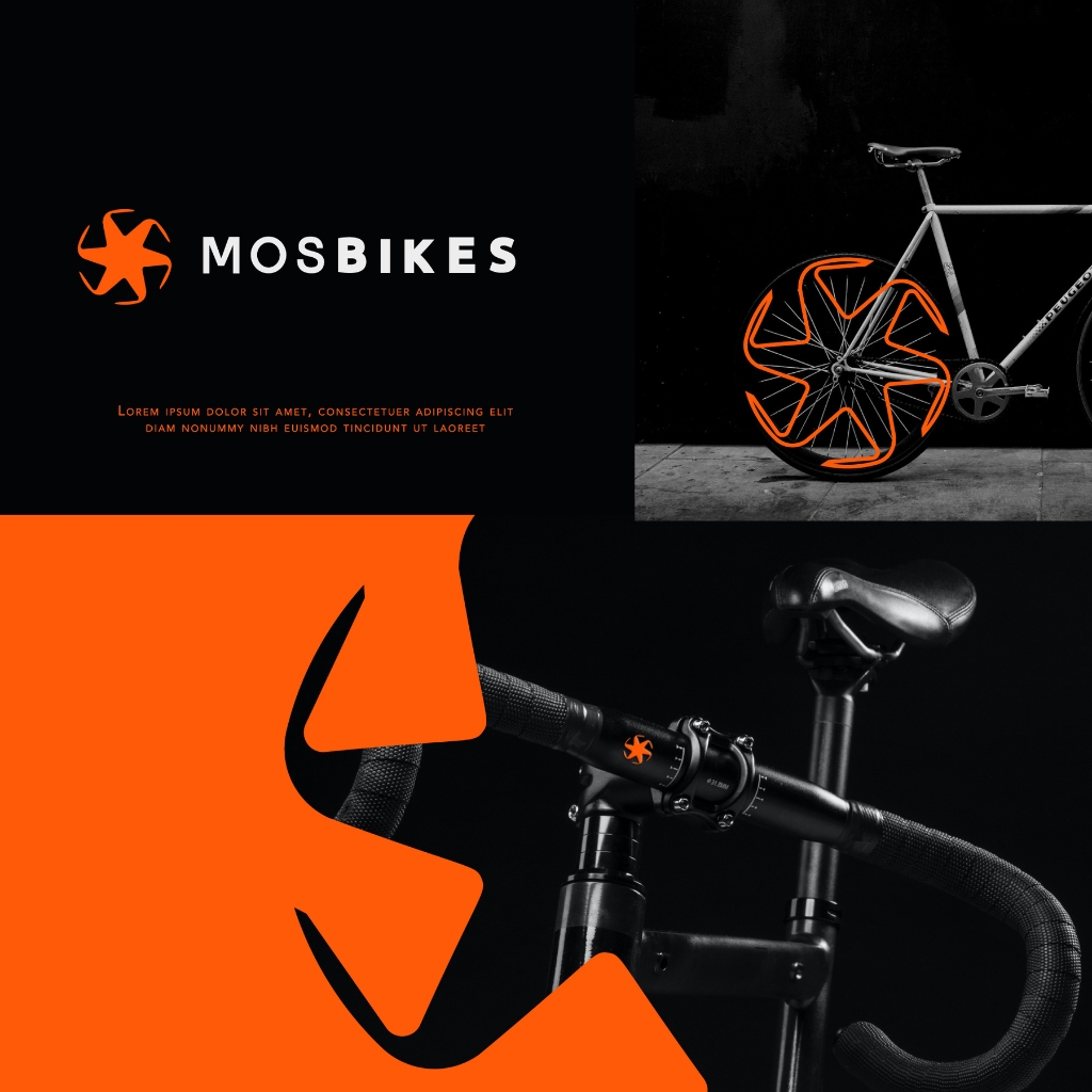
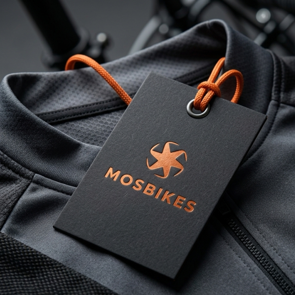
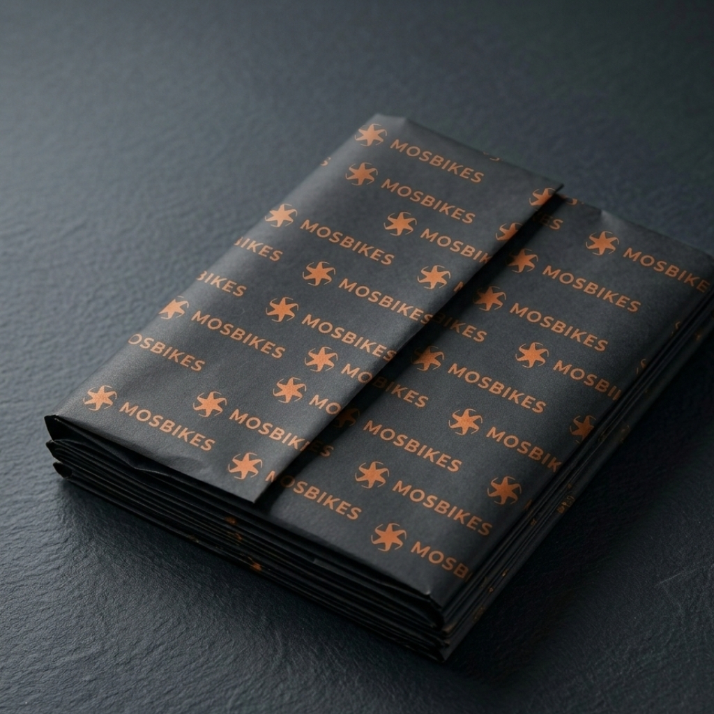
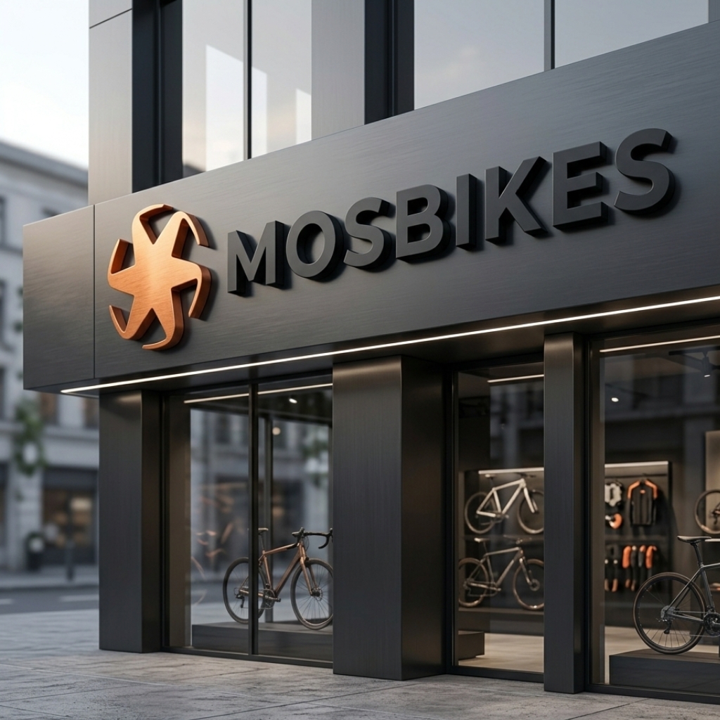
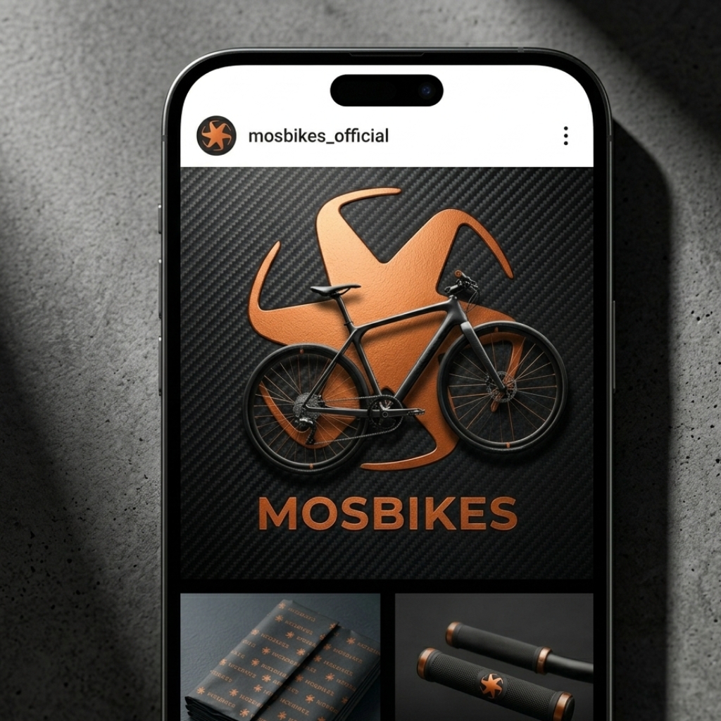
MOSBIKES appears to be a bicycle-related brand presented through a bold and modern visual identity. The design uses a strong black-and-orange contrast, combined with a clean typographic treatment and dynamic logo applications across the bicycle and brand visuals.
he concept is built around motion, energy, and continuous flow. The symbol has a dynamic circular form that visually connects with the movement of bicycle wheels, creating a strong relationship between the brand mark and the product itself. The identity feels bold, sporty, and highly recognizable.
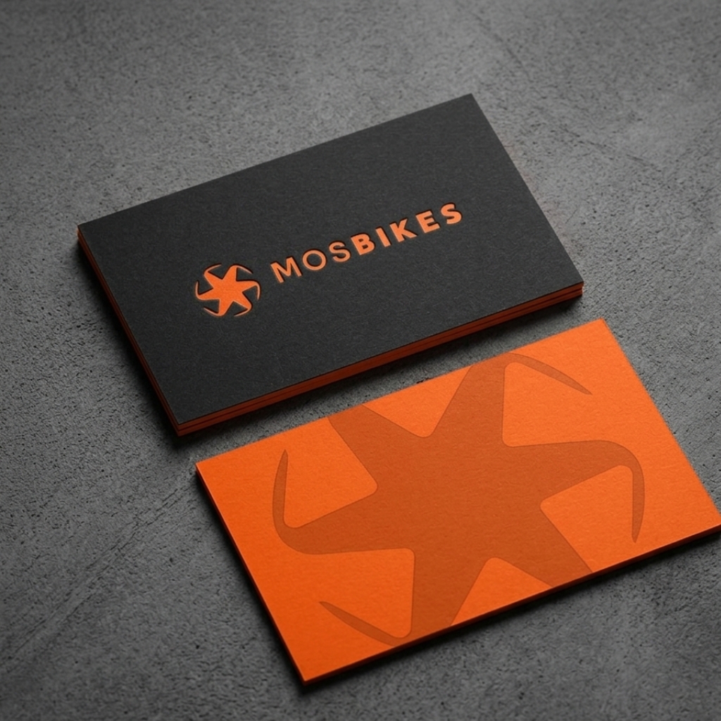
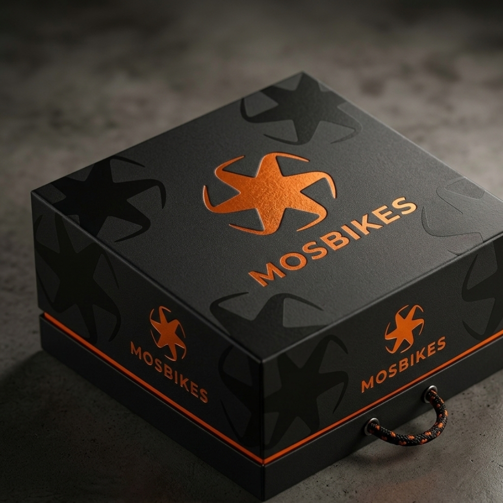
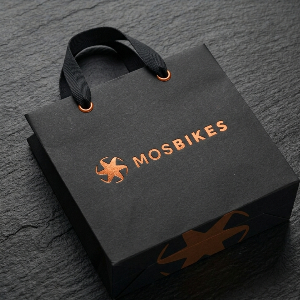
Color Palette
Orange — Bright energetic orange
Black — Deep black
White / Light Gray — Used for text and contrast
Typography
Primary Typeface: A bold modern sans-serif uppercase style is used for the word MOSBIKES, giving the brand a clean and confident appearance.
Secondary Typeface: A simple sans-serif style is used for the supporting text below the logo.
Looking for a professional brand identity? Let’s work together to build your brand.